
How to Style a Palm Springs Living Room
A Palm Springs living room should feel bright, relaxed, and considered. It does not need to copy a hotel lobby or use every desert reference at once. The best rooms use light, natural texture, a few confident color choices, and one focal piece that gives the space a clear point of view.
Wall art is often the fastest way to establish that direction. A poolside print can make a neutral sofa feel more social. A desert scene can make a modern room feel warmer. A classic car or wildlife piece can give an otherwise quiet space the personality it was missing. The artwork does not need to match every object in the room. It needs to make the room feel more complete.
This guide shares practical Palm Springs living room ideas for choosing color, wall art, furniture, framing, and styling details. Use it to decide what mood you want first, then build the room around one or two intentional choices instead of adding decor at random.
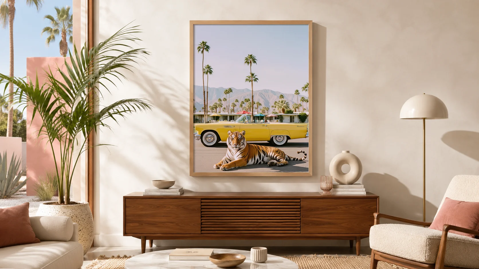
What makes a Palm Springs living room feel right?
Palm Springs style sits between desert modern calm and playful California energy. It often combines clean-lined furniture, warm materials, open space, and controlled color. The room should feel comfortable enough for everyday life, but distinct enough that it does not fade into a generic neutral interior.
Five elements usually do the most work:
- Open space: leave room around the main furniture and avoid covering every surface with small decorative objects.
- Natural materials: oak, walnut, linen, cane, rattan, stone, clay, plaster-like finishes, and woven texture make the room feel sun-warmed rather than formal.
- Focused color: use turquoise, faded pink, mustard, rust, olive, or red as accents with a neutral foundation.
- Mid-century structure: low-profile furniture, simple silhouettes, and clear architectural lines help the room feel grounded.
- One visual anchor: a substantial artwork, striking rug, statement chair, or sculptural light that gives the room its identity.
The visual anchor is usually where people get stuck. They add cushions, plants, books, ceramics, and lamps, but the wall behind the sofa still feels empty. Start with the main wall instead. Once the focal artwork is in place, the color palette and supporting decor become much easier to choose.
Start with the mood you want the room to have
There is no single Palm Springs living room formula. Before choosing artwork or color, decide how the room should feel in the evening when the lamps are on and people are actually using it.
Quiet desert-modern
Choose warm white walls, oat or sand upholstery, natural wood, stone, linen, and an artwork with open space or a softer desert palette. This direction works well when you want a calm room with enough character to feel finished. Desert wildlife, expansive landscapes, and simple architectural scenes are especially useful here.
Bright poolside
Use pale neutrals as the base, then bring in turquoise, soft pink, coral, pale blue, or a small amount of yellow. Poolside art, palms, bright water, and resort architecture can make the room feel lighter and more social. Keep the furniture simple so the color stays intentional rather than busy.
Retro California
Build around walnut, tobacco leather, cream upholstery, olive, rust, red, or mustard. This direction can handle a classic car, roadside motel, or bolder wildlife composition. It works especially well in a living room that needs more structure, contrast, and a story-led focal piece.
You can borrow from more than one direction, but let one mood lead. A calm desert room with one turquoise pool print feels deliberate. A room with desert neutrals, neon, palms, pink, red, yellow, and several competing art pieces usually feels undecided.
Use wall art as the living room anchor
In a Palm Springs living room, wall art should not be an afterthought. It can be the element that connects the sofa, rug, coffee table, and accent colors into one composition. A single substantial print often feels more confident than a scattered collection of smaller pieces with no shared direction.
Choose the artwork by the job it needs to do:
- Bring color to a neutral room: use poolside scenes, turquoise water, pastel architecture, flamingos, or a print with one focused sunny color.
- Make a minimal room feel warmer: choose open desert light, natural wildlife, a motel scene, or an architectural composition with more texture and depth.
- Add personality without adding clutter: choose a classic car, a tiger, a leopard, or another unexpected subject in a clean, balanced setting.
- Calm down a room with strong furniture: choose a composition with open sky, muted color, or fewer competing details.
A living room print does not need to be literal Palm Springs imagery to work. What matters is the feeling: sun, air, color, architecture, landscape, and a little confidence. For a broader overview of the style, see our Palm Springs decor ideas guide.
Build the color story around the artwork
The easiest way to make a room feel designed is to repeat one or two colors from the artwork elsewhere in small, quiet ways. You do not need to match the print exactly. A hint of turquoise in a book cover, a muted rust cushion, a pink ceramic bowl, or an olive plant pot is enough to create a connection.
- For turquoise or pool blue art: pair it with warm white, sand, oak, linen, and a small blush or coral accent.
- For pink or coral art: use cream, pale wood, tobacco, and soft green to keep the room from feeling overly sweet.
- For yellow or mustard art: add warm neutrals, walnut, clay, olive, and a touch of black for structure.
- For red-car or roadside art: use calm upholstery and natural materials so the artwork remains the strongest color note.
- For quiet desert scenes: layer oat, stone, clay, warm white, and natural wood instead of adding more decorative color.
Choose a neutral base first, then use the art to decide the accent. This gives the room hierarchy. It also makes it easier to update smaller accessories later without replacing the main furniture or the wall art.
Palm Springs living room wall art: size, placement, and finish
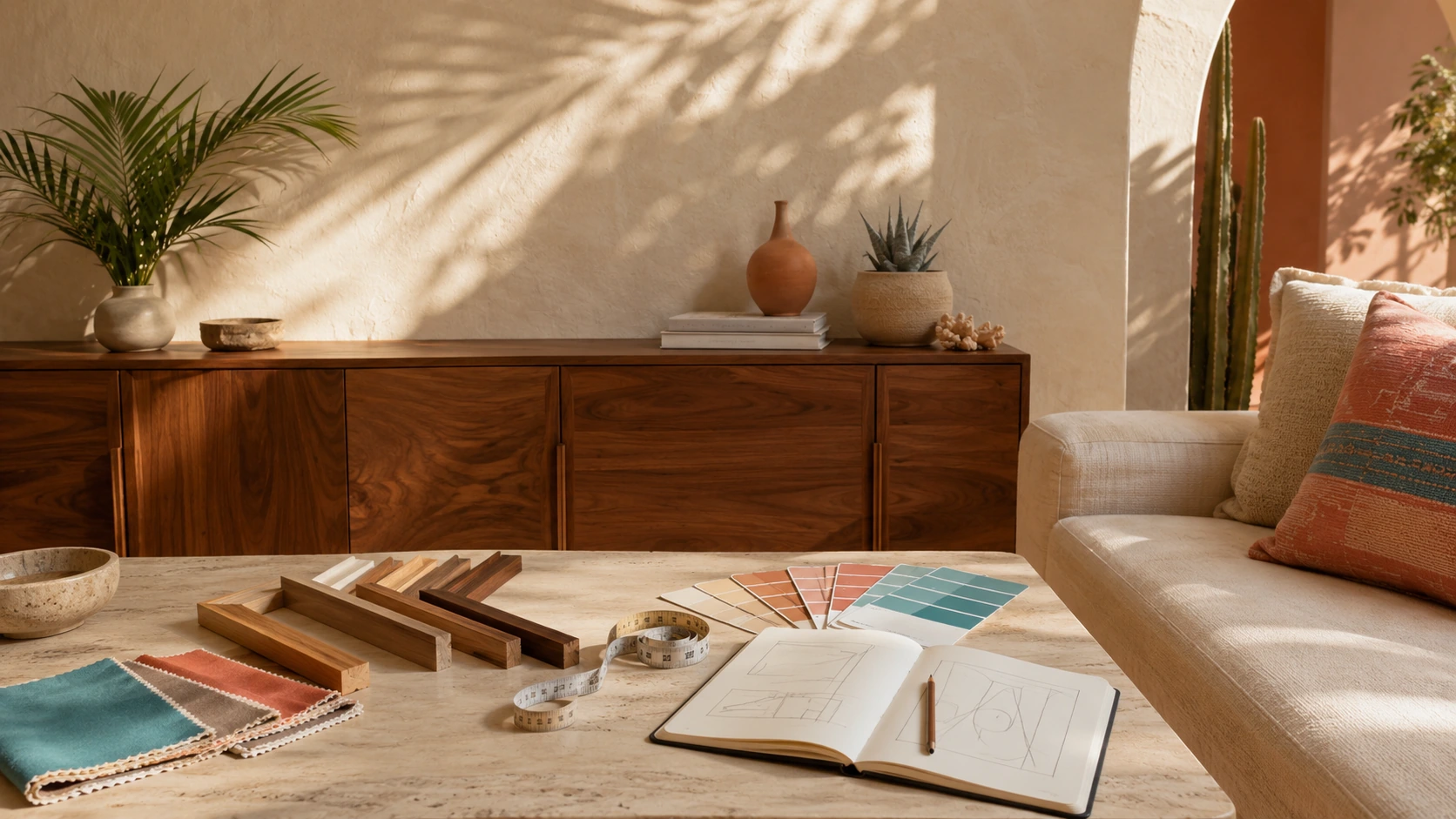
The right image can still look wrong when the scale is too small for the sofa wall. For most living rooms, the overall artwork or grouping should relate to the width of the furniture below it. A practical starting point is a piece or arrangement that reads as roughly 60–75% of the sofa width.
Above a compact sofa, an 18 × 24-inch print can work as one clear focal piece. Above a standard sofa, a 24 × 32-inch framed print often gives more visual weight. Wide sofas may need a larger format, a pair, or a grouping rather than one small print floating in the center. Leave enough wall on both sides so the artwork has room to breathe.
For balanced placement, see our guide to how high to hang wall art above a sofa.
Keep the frame close enough to the sofa that the two read as one composition. Around 6–10 inches between the top of the furniture and the bottom of the frame is a useful starting point. For detailed placement and format guidance, use our wall art size guide.
Finish changes the feeling of the same image:
- Natural wood framed print: adds warmth and works especially well with oak, linen, cane, stone, and desert-neutral rooms.
- Dark framed print: gives more structure to a living room with walnut, leather, charcoal, or deeper color accents.
- Canvas: feels softer and more relaxed in an airy, casual room.
- Framed canvas: adds depth when the artwork needs to become the main feature of the wall.
Choose the scale first. Then choose the finish that gives the art enough visual presence for the room.
Find a Living Room Focal Point
Explore poolside color, desert atmosphere, retro cars, and wildlife art designed to give a living room one clear direction.
Five Palm Springs living room art directions
For a bright, social sofa wall
Tiger on Pool Float brings turquoise water, a clear animal focal point, and a lively poolside mood. It works well in a neutral living room that needs one confident burst of color without adding more objects to the space.
For a calm desert-modern living room
Desert Giraffe suits rooms with plaster tones, linen, pale wood, stone, and softer light. Its open setting gives the wall presence without making the room feel over-styled.
For retro California structure
Leopard on Classic Cadillac is a strong choice for a living room with walnut, leather, black accents, or mid-century furniture. The car provides the graphic shape, while the leopard keeps the piece expressive and less predictable than conventional automotive art.
For a playful poolside palette
Flamingos at Pink Pool Courtyard works in brighter rooms with cream upholstery, warm oak, soft pink, and turquoise details. It is especially useful when the art is meant to set the palette for the whole space.
For a warmer, cinematic conversation piece
White Tiger at Desert Rose Motel adds roadside atmosphere, a classic car, and evening warmth. It is a strong fit for a living room with deeper wood tones, textured neutrals, and a more story-led direction.
Style the wall around the art, not against it
Once the main artwork is chosen, keep the surrounding wall quiet. Let the piece have enough empty space to read from across the room. A plant, floor lamp, low console, or sculptural chair can support the composition, but none of them should compete with the image.
On a sofa wall, use cushions and throws to echo one small accent from the art. On a console wall, use one lamp, one vase, and one small object rather than several unrelated accessories. The artwork should look integrated, not boxed in by decor.
If you want more than one print, create a clear reason for the grouping: shared frame finish, a consistent color palette, similar subject matter, or even spacing. A grouped wall looks stronger when it reads as one composition instead of several separate purchases.
Common Palm Springs living room mistakes
Choosing art that is too small for the sofa wall
Small art above a broad sofa can make the room feel unfinished. Measure the furniture first and choose a scale that can hold the wall. When you are between two sizes for the main focal point, the larger option is often the safer choice.
Trying to match every color exactly
Exact matching can make a room look stiff. Use the artwork as the source of one or two accent colors, then let the rest of the room stay neutral and material-led.
Using too many Palm Springs references at once
Palms, flamingos, cacti, neon, cars, pink, turquoise, and patterned textiles do not all need to appear in one room. Choose one or two leading references and let the rest of the space remain calm.
Overfilling the wall around the focal piece
When art is already carrying the color and narrative, the wall does not need extra signs, mini frames, or competing objects. Empty space is part of the styling.
Choosing a frame before deciding the artwork’s role
Frame finish should support the image and the room, not drive the decision. Start with the mood, image, and scale. Then choose natural wood, dark framing, canvas, or framed canvas based on the visual weight the wall needs.
Palm Springs style and desert modern: where they overlap
Palm Springs style and desert modern share sunlight, open space, natural materials, and a connection to desert landscapes. Palm Springs living rooms can be brighter, more playful, and more retro. Desert modern rooms are usually quieter, more architectural, and more restrained with color.
You can move between the two depending on the room. A calm sofa, plaster wall, and desert modern art print may be exactly right for a quiet space. A brighter room may need turquoise water, poolside architecture, or a graphic animal scene from Poolside Vibes. For retro-road and wildlife character, explore Cars & Animals.
The best Palm Springs living room idea is not a formula. It is one clear focal point, a palette that supports it, and enough space for the room to feel easy to live in.
FAQ
What colors work best in a Palm Springs living room?
Warm white, sand, clay, oak, walnut, turquoise, pale blue, blush pink, coral, olive, mustard, and rust all work well. Start with a neutral foundation, then let one or two colors from the art become accents.
What wall art works best above a sofa in a Palm Springs living room?
Choose a substantial piece with a clear focal point and enough scale for the sofa wall. Poolside scenes, desert architecture, open wildlife compositions, classic cars, and motel art can all work when the image matches the room’s mood.
How big should wall art be above a living room sofa?
A useful starting point is an artwork or grouping that reads as roughly 60–75% of the sofa width. The exact size depends on the wall and furniture, so use a tape outline or our wall art size guide before choosing.
Can a neutral living room still feel Palm Springs-inspired?
Yes. Natural wood, linen, stone, pale walls, one plant, and a focused artwork can create the mood without needing bright color everywhere. Let the artwork introduce the strongest accent.
Should I choose framed art or canvas for a living room?
Framed art adds structure and works well with furniture-led rooms. Canvas feels softer and more relaxed. Framed canvas adds depth when the artwork needs to become the main feature of the wall.
What is the difference between Palm Springs style and desert modern?
Palm Springs style is often brighter, more playful, and more retro. Desert modern is usually quieter and more material-led, with stronger emphasis on architecture, natural texture, and open space.