
Palm Springs Color Palette: 8 Colors for a Desert-Modern Home
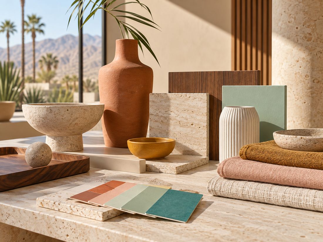
Palm Springs interiors are known for a mix of sun-washed neutrals, architectural whites, desert earth tones, turquoise water, and confident accents. The strongest rooms do not use every color at once. They build a calm base, then add two or three colors that feel connected to the landscape, pools, mid-century architecture, and warm California light.

The core Palm Springs color palette
A useful Palm Springs palette starts with a neutral foundation and adds color in controlled layers. Think warm white, sand, terracotta, blush pink, mint, turquoise, mustard, and deep brown or black. The exact mix depends on whether the room feels more desert-modern, resort-like, or retro mid-century.
1. Warm white
Warm white keeps rooms bright without feeling cold. Use it on walls, ceilings, large upholstery pieces, and areas where artwork needs visual breathing room. A slightly creamy white works especially well with natural wood, travertine, linen, and oak frames.
2. Sand and beige
Sand tones connect directly to the desert landscape and make stronger colors easier to use. They work well in rugs, upholstery, plaster finishes, curtains, and large pieces of furniture. A sand base also gives colorful wall art more presence without making the room feel busy.
3. Terracotta
Terracotta introduces warmth and depth. It can appear in pottery, cushions, tile, leather, or a single accent wall. Use it sparingly if your artwork already contains warm reds or orange tones.
4. Blush and dusty pink
Pink is one of the most recognizable Palm Springs accent colors because it works naturally with desert light, retro motel architecture, and turquoise water. For a more sophisticated room, choose dusty or muted pink rather than a highly saturated bubblegum tone.
5. Mint green
Mint brings a cool architectural note into a warm room. It works especially well with walnut, cream, brass, and pale stone. Our Tiger at Mint Door uses this contrast directly: cool pastel architecture against wildlife and classic-car detail.
6. Turquoise and pool blue
Turquoise is the strongest resort signal in the Palm Springs palette. It references pools, sky, glass, and modernist exteriors. Use it in artwork, ceramics, textiles, or one larger focal object rather than repeating it across every surface.
7. Mustard and sun-faded yellow
Yellow works best as a controlled accent. It can warm up a neutral room and pairs especially well with walnut, cream, olive, and turquoise. In a retro-leaning room, mustard can make the palette feel more grounded than a brighter lemon yellow.
8. Deep brown, charcoal, or black
Dark tones keep a pastel-heavy room from feeling too soft. Use them in lighting, thin metal frames, furniture legs, shelving, or architectural details. A small amount of contrast makes pale colors feel more intentional.
How to combine Palm Springs colors without making the room busy
A simple rule is to choose one dominant neutral, one secondary material tone, and two accent colors. For example: warm white walls, walnut furniture, turquoise artwork, and dusty pink textiles. Another combination could be sand, oak, mint, and terracotta.
Do not try to match every color from a print. Instead, pull one or two colors from the artwork and repeat them elsewhere in smaller amounts. That creates cohesion without turning the room into a themed set.
Desert modern vs retro Palm Springs color
Desert-modern rooms usually lean quieter: sand, clay, warm white, natural wood, muted green, and soft black. Retro Palm Springs rooms can support more contrast: blush pink, turquoise, mint, mustard, and brighter architectural white.
If you prefer the calmer direction, start with our desert modern art guide. If you want a more colorful visual route, browse the Poolside Vibes collection.
Using wall art as the color anchor
Artwork is one of the easiest ways to introduce color because it does not require repainting the room or replacing large furniture. A single print can establish the palette for cushions, ceramics, books, or a small side table.
For a pool-led palette, choose art with turquoise water and pale architecture. For a warmer room, look for desert light, classic cars, terracotta, or red accents. For a softer pastel direction, pink motel details, mint architecture, and flamingos can work as the starting point. Compare the blush, turquoise, and resort scenes in our flamingo wall art collection before choosing a print for the room.
Three ready-made Palm Springs palettes
Calm desert modern
- Warm white
- Sand
- Walnut
- Terracotta
- Soft black
Use this palette for a quieter living room, bedroom, or office. Pair it with Wild Desert Scenes.
Poolside resort
- Architectural white
- Turquoise
- Blush pink
- Mint
- Natural oak
This works well in bright living rooms, guest rooms, pool houses, and playful modern interiors. Browse poolside wall art for artwork built around this color language.
Retro automotive
- Cream
- Walnut
- Mustard
- Red or coral
- Charcoal
Use this palette when classic cars and roadside imagery are the focal point. Explore Retro Car Wall Art.
Final rule: let the room stay edited
For the broader room strategy — furniture, materials, lighting, and how the artwork fits into the whole space — continue with our Palm Springs decor ideas and styling guide.
Palm Springs style is strongest when color has space around it. Keep the foundation calm, choose a small number of accents, and let one or two pieces carry the strongest color story. That balance is what makes the room feel designed rather than themed.
Find Art for Your Palm Springs Palette
See how turquoise, blush and warm retro tones work together in our colorful animal and vintage-car gallery wall ideas.
Browse artwork by mood, color, and subject, from poolside turquoise to desert neutrals and retro-car color.